
Swarajability- Youth 4 Jobs
Redesigning of SwarajAbility’s Job Discovery Experience to improve clarity, accessibility, and candidate engagement.
The Project at a Glance
Project Type
UX design and maintenance
Project Duration
2 month
Contribution, Methods and Tools
Accessibility improvements, Maintenance, Usability Studies, Hi Fidelity Designs, Figma
Role
UX Designer (Maintenance Phase)
Priority Areas
Home Page Job Listings
Recommended Jobs in Candidate Dashboard
Outcome
Successfully rolled out
Increased Job Cards Engagement by 35%
Increased screen reader compatibility and improved accessibility by 89%
As part of my commitment to client confidentiality, I’ve carefully modified certain details in this case study to comply with our non-disclosure agreement (NDA). This overview focuses only on the high-level research and design process while ensuring all proprietary information remains secure.
B A C K G R O U N D
The Context
SwarajAbility is a job search and application platform developed by Youth4Jobs to bridge the employment gap for persons with disabilities (PwDs) across India. It simplifies accessibility, job discovery, and inclusive workforce connections while supporting employers and candidates alike.
My Role
While the platform served a strong purpose, job discovery relied heavily on card-based layouts that lacked clarity, consistency, and accessibility, especially for first-time or assistive-tech users.
As the only designer in this phase, my work focused on refining the job card experience in two critical touchpoints:
Home page job listings
Recommended Jobs tab within the candidate dashboard
U N D E R S T A N D I N G T H E P R O B L E M
Problems for the Job Seekers:
Limited visibility of locations
Jobs available across multiple locations were shown with only a single location, making roles appear less relevant than they actually were.
Unclear distinction between actions and information
The “Full Time” label visually resembled a button, causing confusion about what was clickable versus what was informational.
High cognitive load while scanning jobs
Job cards lacked a clear information hierarchy, forcing users to spend extra effort understanding key details such as role, location, salary, and job type.
No way to save or bookmark jobs for later
Without a save mechanism, users had to repeatedly search for the same roles, increasing effort and frustration during the job discovery process.
Recommended Jobs- Candidate Dashboard
The advanced search filter lacked consistency with the platform and also scored low on accessibility criteria.
There was no option to save/bookmark jobs to revisit them later.
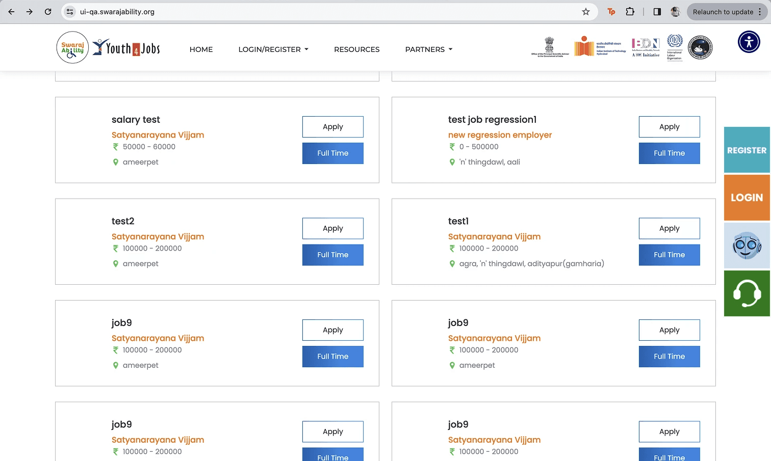
Home Page Job Listings
2
THE OLDER APPLICATION

3
4
5
The cards represented only one location, and users had to click on "apply" to see multiple locations.
The sections cometed for attention without a clear heirarchy.
Both "apply" and "Full time" gave sense that they are buttons, while "Full time" was a label representing the job type.
1
Problems for the Business:
Under-representation of available job coverage
Showing only one location per job limited the perceived reach of employers, potentially reducing application rates for multi-location roles.
Lower engagement with recommended jobs
Confusing card layouts risked users overlooking relevant opportunities, affecting overall job discovery and application metrics.
Misalignment with accessibility goals
Ambiguous visual cues and unclear hierarchy conflicted with the platform’s mission of providing an inclusive, low-friction experience for persons with disabilities.
Limited insight into user intent
Without saved-job signals, the platform lacked a way to understand user interest and refine future recommendations.
T H E A I M
Defining the Aim
I identified and analyzed the key pain points in the existing job cards and further narrowed the problem scope to focus on the most impactful areas for the redesign:
How might we improve job card clarity and consistency so candidates can quickly understand, evaluate, and act on opportunities—while accurately representing job availability and supporting SwarajAbility’s accessibility goals?
F I R S T S T E P S
Design Requirements
Once the key friction points in the existing cards were identified, the next steps were a clear definition of what we wanted to incorporate as design suggestions.
Clear Information
Hierarchy
Visually Elevate
the UI
Accurate representation
of locations
Support for
Job Shortlisting
Clear distinction
between actions
and labels
Accessibility- First
Design
Clear Information Hierarchy
Job cards should surface the most critical information—job role, employer, location, and compensation—at a glance, enabling quick scanning and comparison.
Visually Elevate the UI
Elevate the UI through consistent, accessible job card design and enhanced filtering in recommended jobs.
Accurate Representation of Locations
Jobs with multiple locations should clearly indicate broader availability, preventing misinterpretation and improving discoverability.
Support for Job Shortlisting
Users should be able to save or bookmark jobs within the recommended jobs tab, allowing them to revisit opportunities without disrupting their exploration flow.
Clear distinction between actions and labels
Primary actions (e.g., Apply, Save) must be visually distinct from informational labels (e.g., job type), reducing ambiguity and accidental interaction.
Accessibility-First Design
All components should meet accessibility considerations, including clear labels, and proper screen reader alignment in accordance with SwarajAbility’s inclusive mission.
I T E R A T I O N S A N D S O L U T I O N
Redesigning job cards
The job cards were redesigned through multiple iterations, focusing on improving visual hierarchy, clarity, and accessibility. Early explorations tested different information groupings and visual treatments to reduce clutter and make key details easier to scan. Based on feedback and feasibility constraints, the design was refined to clearly separate actions from informational elements, support multi-location roles, and maintain consistency across screens—resulting in a cleaner, more intuitive job discovery experience.
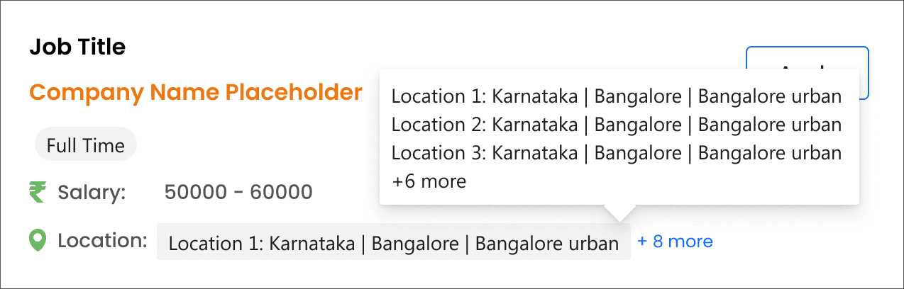

ITERATION 1
What this version solved:
Successfully established a clear content hierarchy
Visually differentiated labels from actions.
The location pattern was enhanced to support multiple locations through an expanded list
Problems with this iteration:
Still limited location context by surfacing only one location at a time
Visually differentiated labels from actions.
The interaction relied on a hover-based information tip, which reduced discoverability and did not fully align with accessibility needs.
ITERATION 2
What this version solved:
Brought in more number of locations on the card
Additional details like post date and required experience were introduced
Iteration 2 was an extension of the previous versions, adding 3 locations at a time.
And displaying additional details like required experience and post date.
Problems with this iteration:
The problem of hover and thereby accessibility issue still prevailed.
This increased the size of the card both through width and length thereby impacting the number of job cards on the home page.
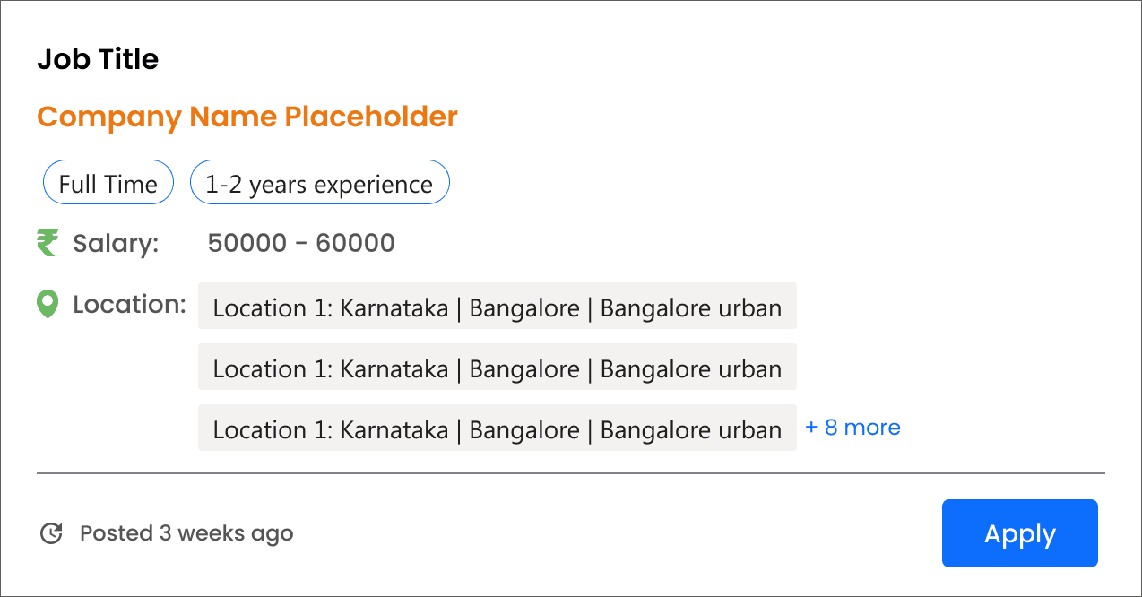
SOLUTION
Why this version worked
Showed up to three locations directly on the card to provide immediate context
Clearly indicated when additional locations were available, linking users to the job details page
Reduced card width to fit three cards per row, increasing visible job listings
Used explicit system messages (e.g., “No more locations available”) to set clear expectations and support screen readers


The redesigned job listings in the homepage
Revamping the Recommended Job tab within Candidate Dashboard
The Recommended Jobs tab within the candidate dashboard was revamped to improve clarity, consistency, and decision-making. Job cards were aligned with the updated home page design to create a familiar experience, while enhanced filtering and save options helped users evaluate opportunities more efficiently without disrupting their flow.

Two tabs for all jobs and bookmarked jobs was introduced for better segregation.
Job recommendations were personalised basis skillset
The advanced filter panel was revamped visually to make it simpler.
Option to search jobs was introduced for ease.
Design Proposals
Recommended Jobs- Candidate Dashboard
An option to switch from card to list view was introduced in case users wanted to get a quick glimpse of multiple jobs matching their skills.
Option to bookmark jobs for later was introduced so the job seekers can revisit them later.
C H A L L E N G E S
Challenges and Reflections
Working on SwarajAbility required making meaningful improvements within an already live, mission-critical platform. The scope was intentionally limited to UI refinement, which meant balancing better clarity and accessibility without introducing disruptive changes to existing flows.
One of the key challenges was surfacing additional job context—such as multiple locations—without increasing visual complexity. Early explorations solved discoverability but introduced accessibility concerns, particularly when interactions relied on hover-based patterns. This highlighted the importance of validating interaction choices beyond visual convenience.
Another challenge was maintaining consistency across different parts of the platform. The home page and candidate dashboard served different user intents, yet needed a shared visual language to reduce learning effort and cognitive load.
My learnings:
This project reinforced the idea that accessibility is not an add-on but a design constraint that shapes better decisions. Designing explicit system messages and avoiding hidden interactions improved clarity not just for screen reader users, but for all candidates.
I also learned how small, incremental changes can create disproportionate impact. Refining hierarchy, spacing, and labels significantly improved scan-ability and confidence without the need for new features or complex interactions.
Finally, the project strengthened my appreciation for iterative design in maintenance work. Each iteration surfaced new insights, reminding me that improving existing systems requires patience, restraint, and a deep respect for real-world constraints.
I M P A C T
Validations
The team gauged the effectiveness of the new design through multiple criteria:
The redesign also improved discoverability, increasing engagement with job listings by 35% (measured through clicks on Apply, Save, and expanded job details).
Redesigned cards improved screen reader compatibility, reducing accessibility issues flagged by Lighthouse from 18 to 2, an 89% improvement.
N E X T S T E P S
Future Explorations
While this phase focused on redesigning the job cards and recommended jobs experience, there are several enhancements that could be explored in the next phase to further improve candidate experience and engagement:
Explore AI-driven recommendations that adjust based on candidate preferences, past applications, or skill profiles. Advanced filters could be made dynamic to highlight jobs most relevant to each user, improving discoverability and reducing cognitive load.
Investigate adding real-time accessibility cues or feedback (e.g., voice prompts, keyboard shortcuts, or progress indicators for multi-step actions). This could further enhance confidence and inclusivity for users relying on assistive technologies.