Collect Logic Reimagined
The Journey of transforming CCMR3’s Debt Collection Tool
to simplify tasks, reduce task time and improve agent experience.


The Project at a Glance
Project Type
Product Re-design
for CCMR3’s CollectLogic
Project Duration
6 months (Phase 1)
Contribution, Methods and Tools
User Research, Stakeholder Interviews, Usability Studies
Competitive Study, Affinity Diagram, Mind Maps
Hi Fidelity Designs, Figma
Role
UX Designer (Phase 1)
Priority Areas (Phase 1)
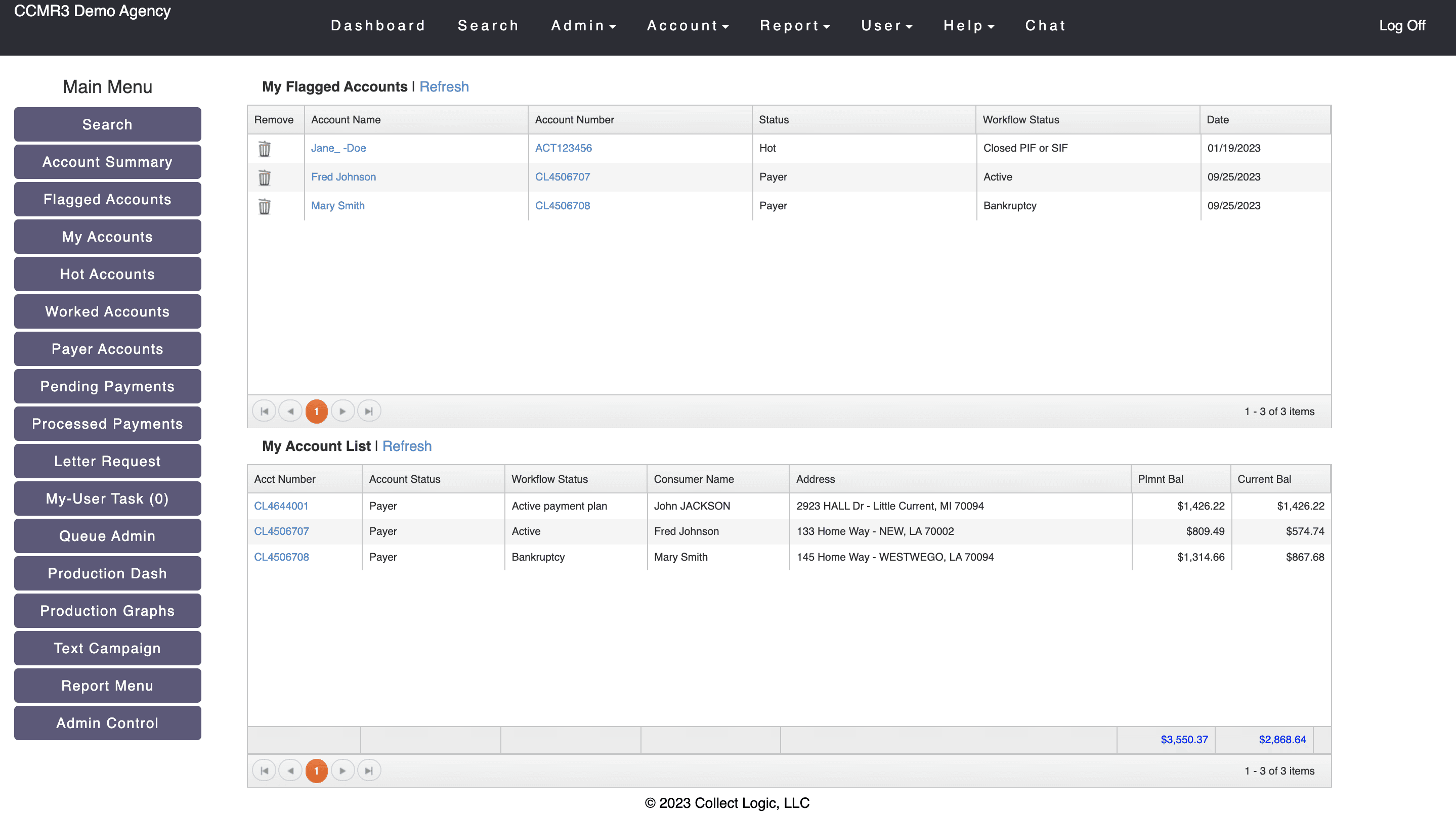
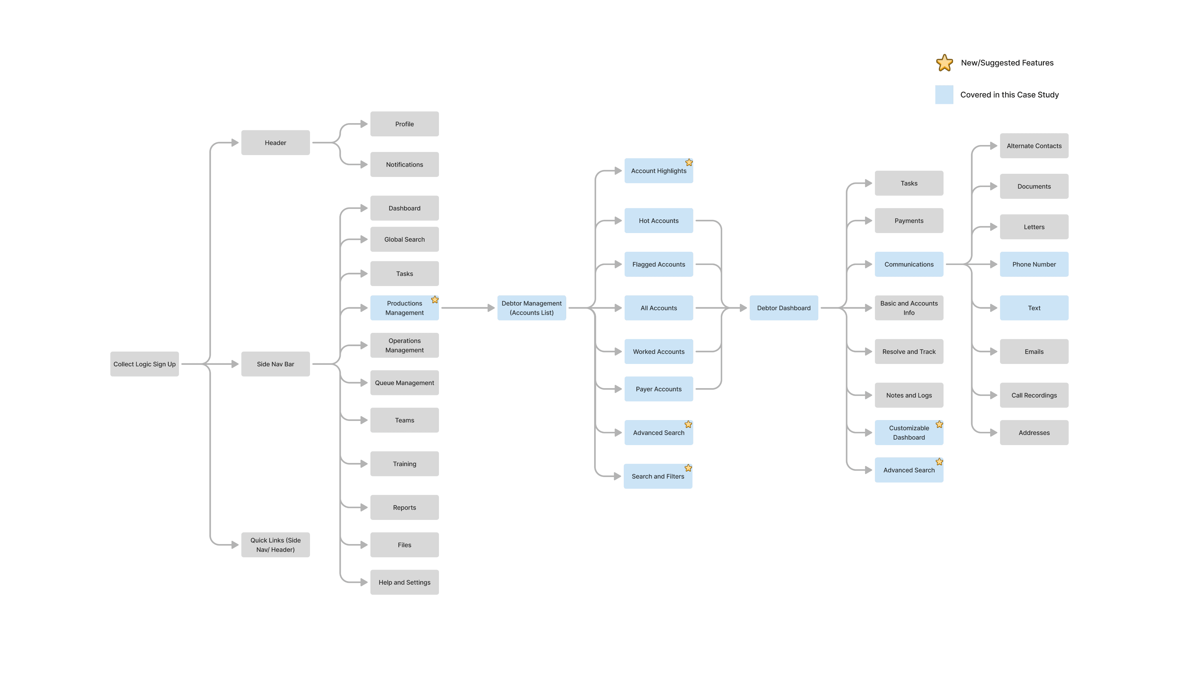
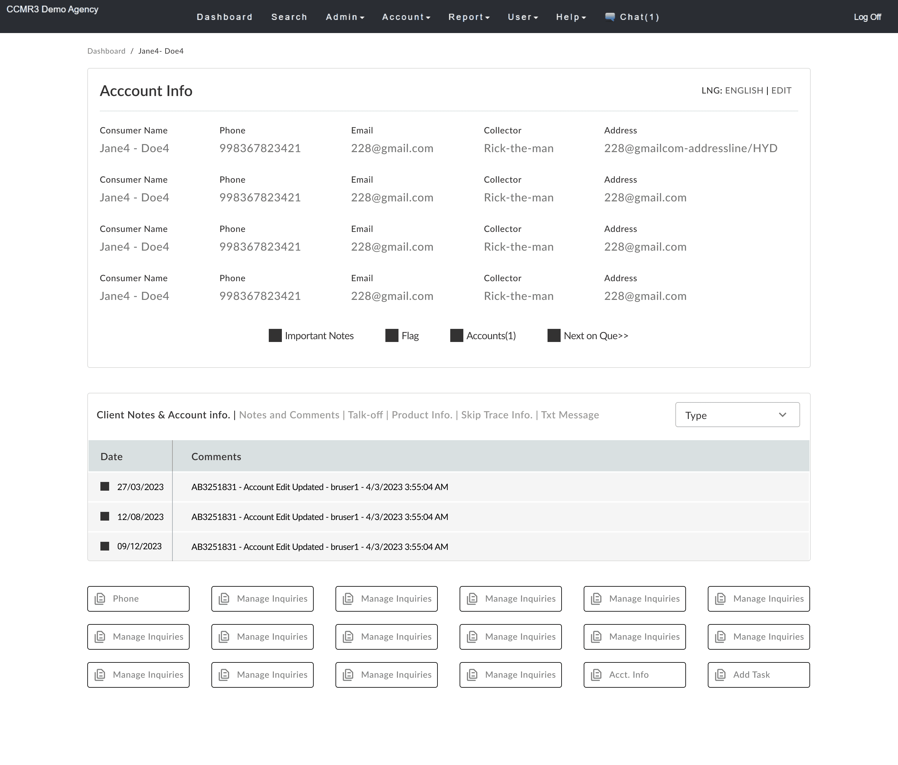
Debtor Accounts List
Debtor Dashboard
Outcome
Successfully rolled out
Decreased Time at task by 73%
Increased Agent Satisfaction by 60%
As part of my commitment to client confidentiality, I’ve carefully modified certain details in this case study to comply with our non-disclosure agreement (NDA). This overview focuses only on the high-level research and design process while ensuring all proprietary information remains secure.
B A C K G R O U N D
The Context
Debt collection agencies help businesses or individuals recover owed money. Their role is to contact debtors, remind them of their obligations, arrange repayment plans, and, if necessary, take legal action to ensure debts are paid. They act as intermediaries to prevent debts from remaining unpaid for too long.
CollectLogic, CCMR3’s trusted debt collection tool, faced new challenges post-COVID as debt surged across the US. With rising demand came the need for a faster, more intuitive platform to help agents navigate efficiently, reduce training time, and minimize errors. I stepped in to lead this challenging yet rewarding redesign project.
Business/Individuals
who are owed money
They share the Debtor’s details with the Debt Collection agency
The agency communicates and negotiates with the Debtor
Debt Collection Agency
Debt paid back/
Repayment plan finalized
My Role Breakdown
As a UX Designer for Phase 1 of the redesign, I helped deliver the MVP within a tight 6-month timeline. Working with 4 other UX designers, I led research and design, collaborating closely with product managers, analysts, developers, and clients. Regular review sessions ensured we developed effective, user-focused solutions.
Mapping out Priorities
Our client identified several personas, including collection agents, operation managers, and administrators, but made it clear that the primary focus for this phase was on Collection Agents. This helped us prioritize key areas for the redesign.
Debtor Accounts List showcasing a list of all the debtor accounts that an agent had access to.
Debtor Dashboard providing all relevant information and action items related to a single debtor.
At a high level, our two main tasks were clear:
to redesign an outdated tool that had been in use for over a decade.
to redefine and design solutions for newly identified user challenges.
Collection
Agents
Operations
Manager
Accounts
Manager
Administrator
Portfolio
Supervisor
Debtor Account List
Debtor Dashboard
While we implemented several significant changes in the redesign, this case study highlights only the most impactful features that delivered remarkable results. I've chosen to focus on these specific features to provide a clear and concise overview, ensuring the case study remains focused and meaningful, rather than overwhelming with every detail.
T H E R O A D M A P
Process Highlights
We already had our area of work defined by the clients for the phase. With this aid, we followed a very structured design process during the redesign and incorporated the HCD thinking. Our first task was to understand the problems in the current application by research and talking to the users.
Discover and identify the problems
Define the
Problem
Brainstorm and Ideate
Create a solution
Keep testing and Iterating
R E S E A R C H A N D D I S C O V E R Y
Flow Analysis of the Application
We started by analyzing the application to understand its features, which helped us have more meaningful discussions with users. Early on, we identified major issues with the navigation and interface—confusing flows made moving between sections difficult.
Usability Testing
We did a usability study on the current application with the collection agents that helped us quickly identify their pain points and prioritize our tasks. We also got an idea of our user’s mental model while using the application which helped us in making design decisions.
Competitive Study
We also did a comprehensive competitive study to identify where our product stood in the market and identify the areas of opportunity for our application in a competitive context. Although the details of the competitive analysis can not be shared due to confidentiality, but after the analysis, we mapped out a SWOT chart for our application.
Established User Base
Industry Expertise
Comprehensive Core Features
Strengths
Outdated User Interface
Complex Navigation
Limited Search and Filtering Capabilities
Lack of Customization
Overloaded UI and Inefficient Action Support
Weaknesses
UI Redesign and Modernization
Advanced Features Integration
Leveraging Technology Trends
Opportunities
Strong Competition from Modern Tools
User Attrition Due to Frustration
High Training Costs
Technological Obsolescence
Threats
Talking to the Users
Once we had an early hang of the application , we immediately began conducting user interviews to gain a deeper understanding of their concerns. We scheduled interviews with 12 users of the application, conducting them online and ran some quick usability studies on the existing application with these users.
During the interviews, our goal was to uncover the challenges users faced while using the application, understand what features they wanted to keep, what they wanted to change, and what new elements they wished to see introduced.
I'd basically have a method to decide what is critical, what is non critical, and I tackle the critical first, whatever needs to be prioritized. Based on client need or business need.”
-A collection Agent who also takes care of Account Admin
Majority of people’s initial difficulty is just becoming familiar with the actions that they're required to perform. There's a lot of information available to them. Especially since it's a terminal interface, so again it requires you the keyboard shortcuts or selection of certain items that tend to be the most difficult thing where I should say that the thing that takes the longest to learn”
-Client services and Collection Manager
I’m finding it hard to look for a module I want to see, not able to add our responses well. If we can do that it’ll be great. Adding a manual message and adding a preset text message to reply with is a challenge.”
-A collection Agent
D E F I N I N G T H E P R O B L E M
Problems for the Collection Agent:
Challenges in the Debtor Accounts List
Inflexible Dashboard
Users couldn't customize the dashboard to show only essential information, making it hard for agents to focus on their priorities.
Lack of Filter and Sort Options
The lack of filter and sort options made tasks more time-consuming and complicated.
Confusing Navigation
Poorly organized sections made navigation cumbersome, especially for new users.
Limited Search Functionality
The app had only a global search, with no option to search within debtor accounts, making it hard to quickly find specific accounts.
Lack of Account Overview
Users couldn't quickly view key account highlights or access their action history, causing inefficiencies.
No Bulk Action
No CSV export for accounts or bulk actions, complicated workflow and increased action time.
2
3
4
5
1
Menu options were not well organized and grouped into sections, making navigation challenging.
No actions history/ accounts overview further led to inefficiencies.
There were no options to search locally within the Debtor Accounts list or filter options to support a search.
No action menu specific to a debtor account or multi-select option to perform bulk actions.
Users couldn’t customize what they wanted to view at a glance so that they could narrow down their focus to the most important features and tasks.
Debtor Accounts List

THE OLDER APPLICATION
Challenges in Debtor Dashboard:
Information Overload
The dashboard overwhelmed users with too much information, making prioritization difficult.
Lack of Customization
Users couldn't customize the dashboard, limiting their focus on relevant tasks.
No Visual Feedback
The absence of a selected state for functions on the dashboard led to user confusion.
Cumbersome Navigation
Navigating to other sections required multiple steps, reducing efficiency.
Additional pain points within specific feature items on the debtor dashboard that needed urgent attention were:
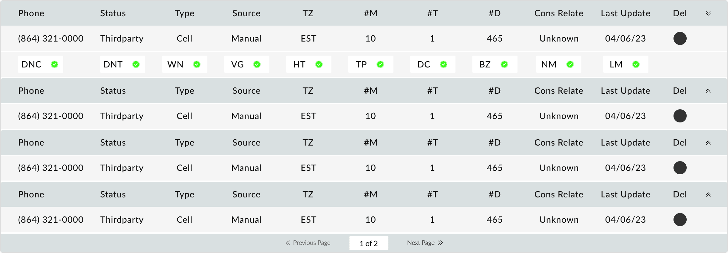
Phone Numbers- Visual Clutter
Setting up phone statuses and dispositions was time-consuming and confusing due to an overload of jargon and iconography.
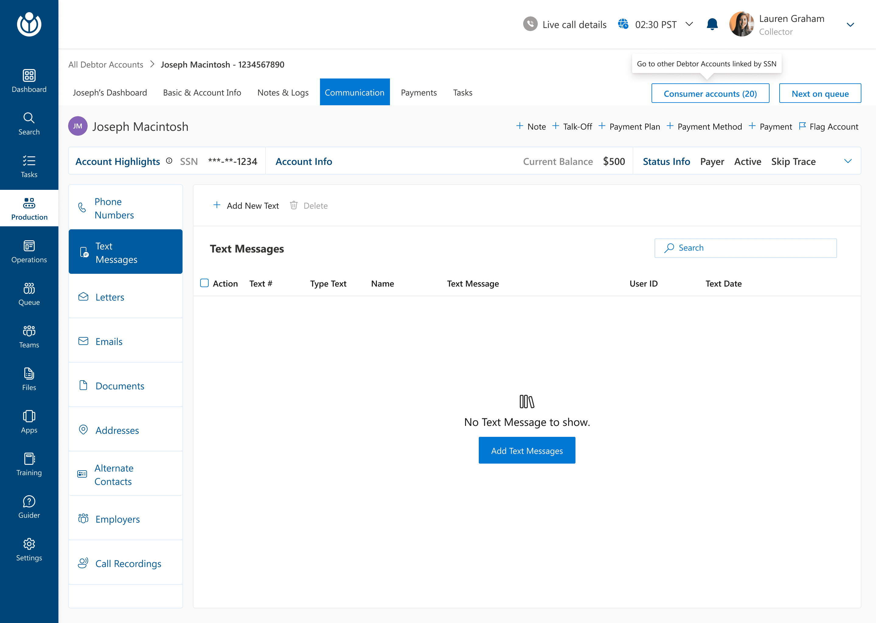
Texts
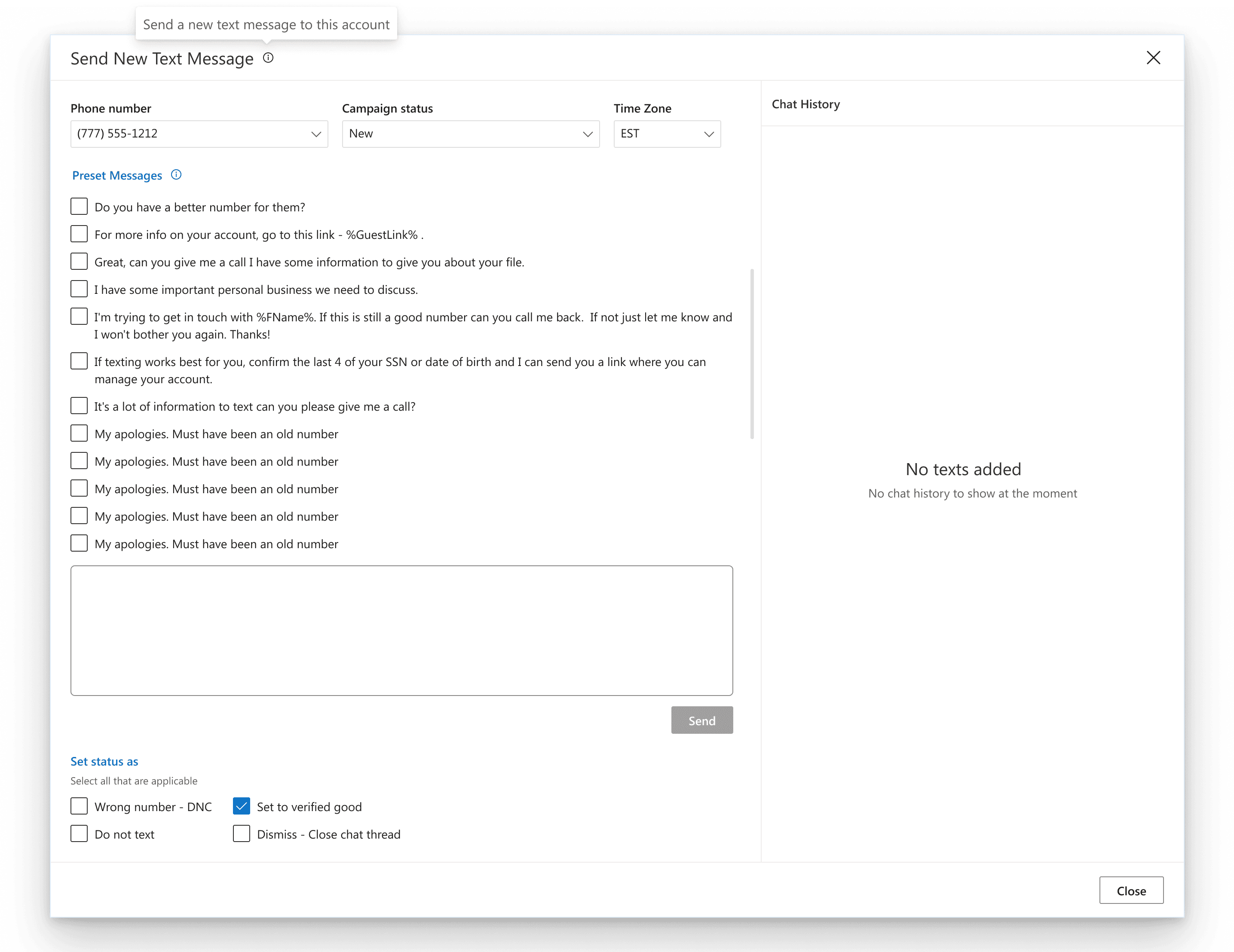
Agents could view text messages but lacked the ability to add preset text messages for communicating with customers, hindering quick responses.
Texts- Debtor Dashboard

Text messages were retrieved only from phone data, but there was no option to add preset messages or automate communication.
There was no visual feedback to suggested a selected state of an action leaading to confusion
Debtor Dashboard
THE OLDER APPLICATION

1
2
3
4
5
The users had no idea where they were at a given time and navigating to other screens required multiple steps.
Extensive use of iconography to set call dispositions demanded additional hours of training to understand and remember what each icon meant and was an error prone action.
There was an information overlaod, inflexibility and no option to customize what the users wanted to see overwhelming them.
Problems for the Business:
The older CCMR application presented certain challenges due to its design, which impacted the business in several ways:
Decreased Productivity
Collection agents struggled with navigation, leading to longer task times and reduced productivity.
Higher Training Costs
The complicated interface increased training time and operational costs, leading to longer time-to-competency.
Increased Error
A cluttered design led to more mistakes, such as incorrect data entry and missed follow-ups, risking client relationships.
Missed Opportunities
Lack of bulk actions and preset communications led to manual repetitive tasks, missing automation opportunities for time and cost savings.
T H E A I M
Defining the Aim
I identified and analyzed the key pain points in the CCMR application, broke down the opportunity areas for improvement, and further narrowed the problem scope to focus on the most impactful areas for the redesign:
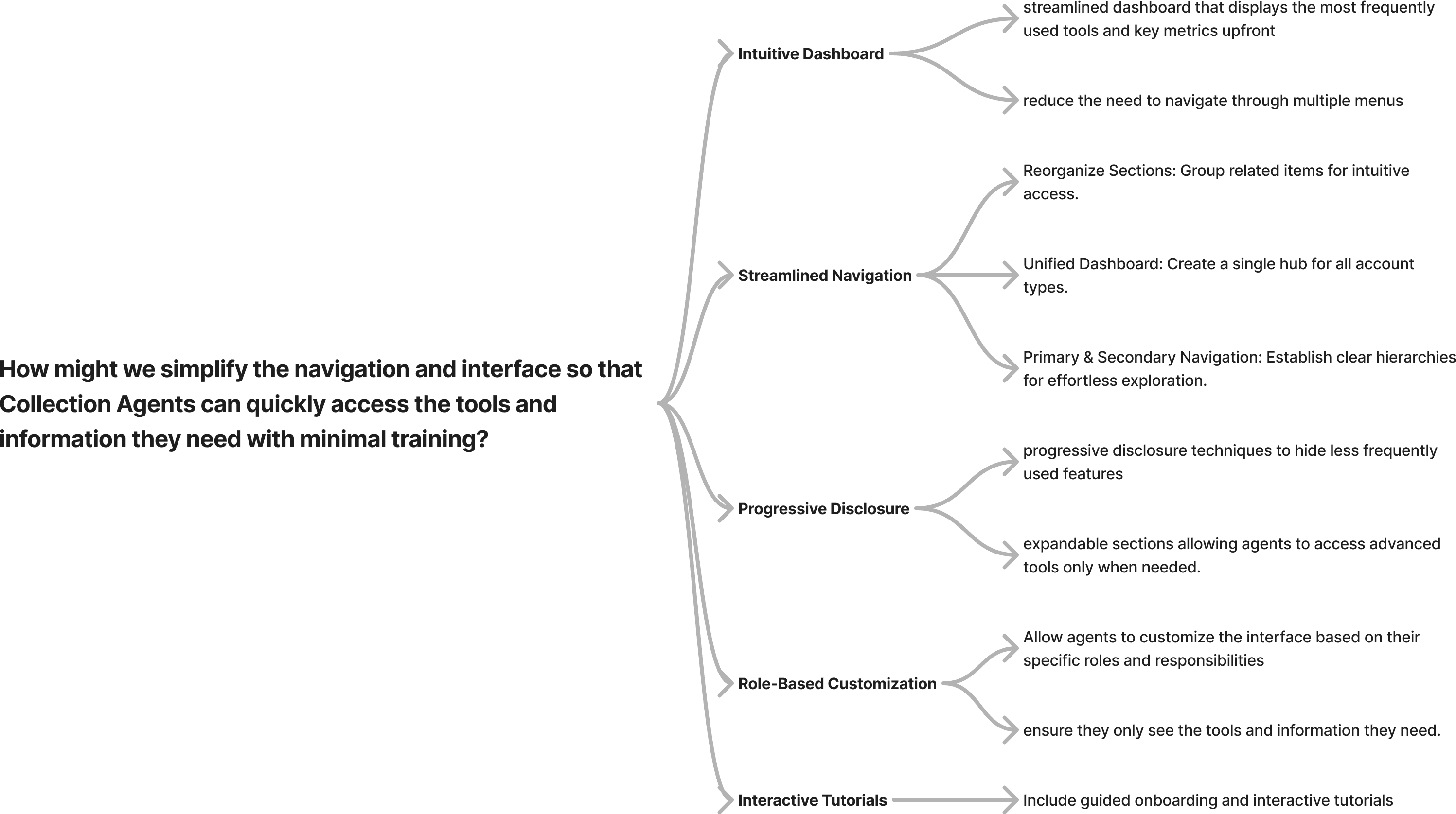
How might we simplify the navigation and interface so that Collection Agents can quickly access the tools and information they need with minimal training?
How might we incorporate efficient search, filtering, and bulk action options to enhance task completion speed and reduce repetitive work?
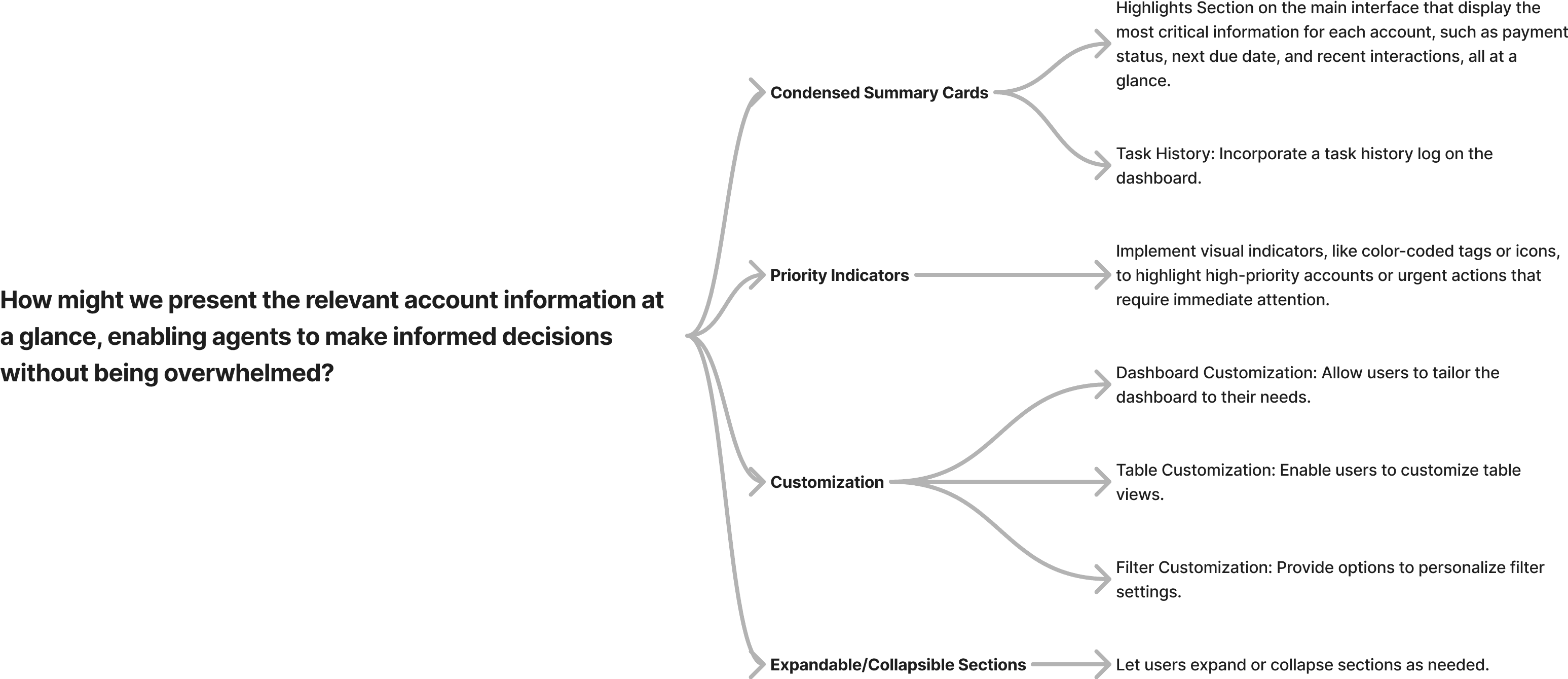
How might we present the relevant account information at a glance, enabling agents to make informed decisions without being overwhelmed?
F I R S T S T E P S
Brainstorm and Ideation
Once we had defined the How Might We’s, we sketched out a mind map with possible solutions for each of the questions. We iterated on this map to reach a solution which we would use as a base mark for the redesign process. This is what we landed onto:

Design Requirements
Now that we had an idea of the gaps in the application, we put a gap-requirement analysis to chalk out solutions one by one. This helped us figure out design requirements.
Agent Requirements
Business Requirements
Competitive Landscape
Simplify navigation
Visually Elevate
the UI
Keep the Users
Informed
Robust Search
Feature
Enhance Actions
Support
Allow Users to
Customize
Simplify navigation
Reorganize Sections: Group related items for intuitive access.
Primary & Secondary Navigation: Establish clear hierarchies for effortless exploration.
Unified Dashboard: Create a single hub for all account types.
Visually Elevate the UI
Modernize UI: Refresh the outdated interface with a contemporary look.
Implement a Design System: Introduce a cohesive design system for consistency.
Uniform Elements: Ensure consistent design patterns across the platform.
Keep the Users Informed
Highlight Section: Add a section to showcase key information at a glance.
Task History: Incorporate a task history log on the dashboard.
Robust Search Feature
Local Search: Add a local search option within specific sections.
Filter Options: Incorporate filters to refine search results.
Advanced Search & Custom Filters: Enable users to create and save personalized search criteria.
Enhance Actions Support
Bulk Actions: Introduce the ability to perform actions on multiple items simultaneously.
Command-Level Actions: Provide command options for quick table actions.
Quick Actions: Implement shortcuts for frequently used actions.
Allow Users to Customize
Dashboard Customization: Allow users to tailor the dashboard to their needs.
Table Customization: Enable users to customize table views.
Filter Customization: Provide options to personalize filter settings.
Expandable/Collapsible Sections: Let users expand or collapse sections as needed.
T H E S O L U T I O N
Redesigning the solution
Step-by-step
Simplifying the Navigation
I charted out an affinity map to organize the different sections on the application into segregated umbrellas. I sorted some cards and laid out an information architecture. Based on feedback from the client we grouped the sections as mentioned in the architecture below.
For this phase, we had to pick the “Production Management” which further broke down to Debtor Management.
Visually Elevating the UI
One of the given facts was that we had to uplift the visual facia of the application and develop a new brand identity since the existing application looked outdated. After some brainstorming and consultation with the other teams, we picked Microsoft’s Fluent Design System for the new design. We tailored it with new brand colours palette centred around tones of Navy Blue to convey professionalism, trust and calmness. We ensured good contrast with a light background and kept accessibility guidelines in check.

Before
After

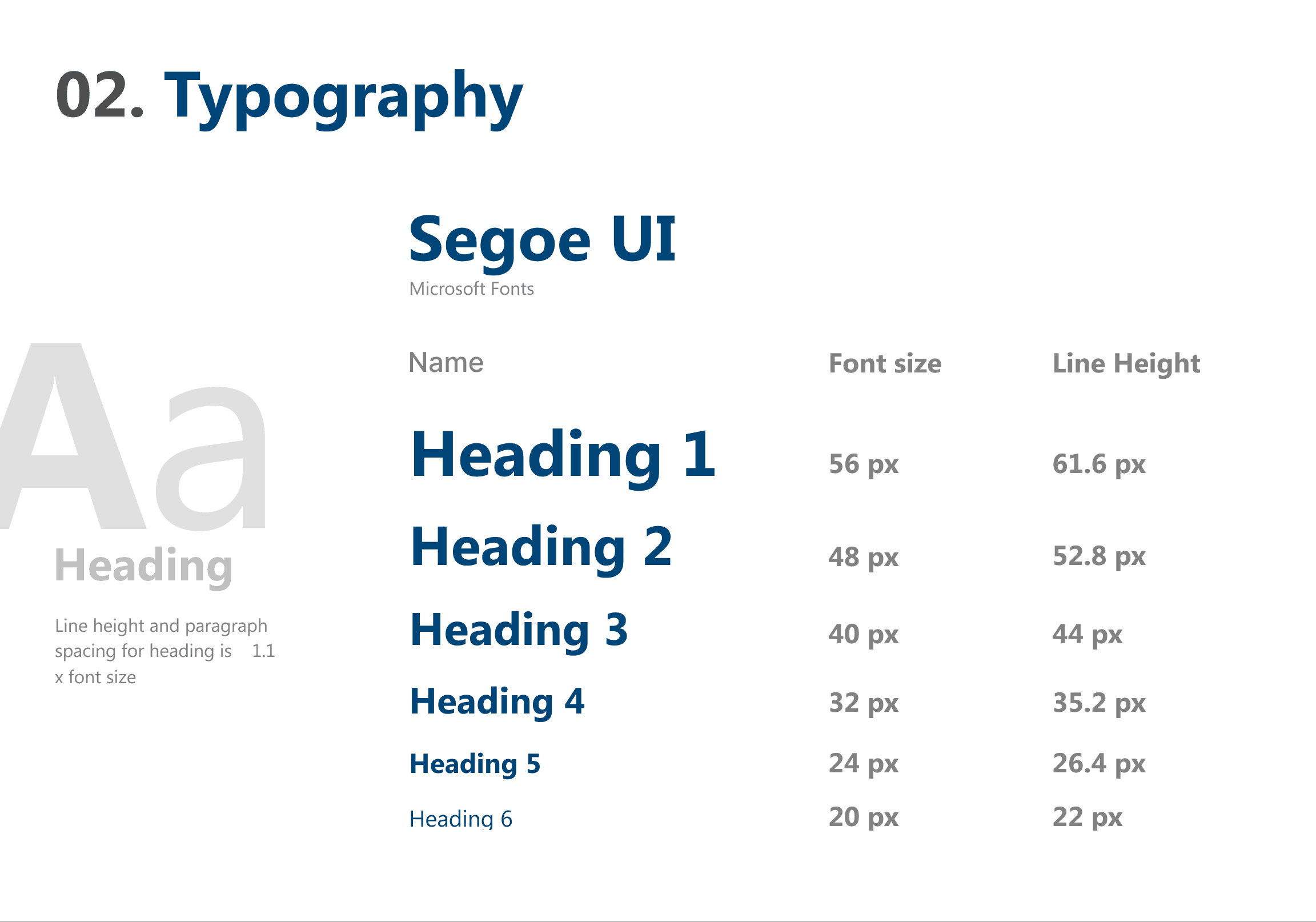

The new UI was updated in accordance with Fluent Design System, tailored with new brand colours and typography.
The older UI did not essentially follow a design system leading to many inconsistencies in button states, typography, colours, spacing, iconography, etc.
Redesiging the Debtor Account List
The Debtor Accounts List
We made some very major Design Decisions in the Debtor Accounts List because this was the start point of the flow into any Debtor’s Account.

Debtor Accounts List
Debtor Accounts List
Redirected to Advanced Search Page
Advanced Search Page
DEBTOR ACCOUNT LIST- WHAT’S NEW
A collapsible account highlight section to provide an overview of the the accounts.
Command level actions* were introduced for the debtor accounts list -
Advanced Search
Customize column
Export as CSV
Refresh
A local search bar for the Debtors account list was introduced.
My Actions section along with a date range filter was introduced to track action history.
A Filters panel with different criteria was introduced to further simplify searching for the required item and reduce time at task.
The critera was decided with the help of CCMR3 team.
Save Filter Pop Up
to create and save a new customized filter for search.
Using the custom filter Pop up
to edit the value for a criteria and use the saved filter
Check boxes for bulk action was introduced and an action menu was also brought in.
DEBTOR ACCOUNT LIST- BREAKING DOWN THE LAYERS OF NAVIGATION
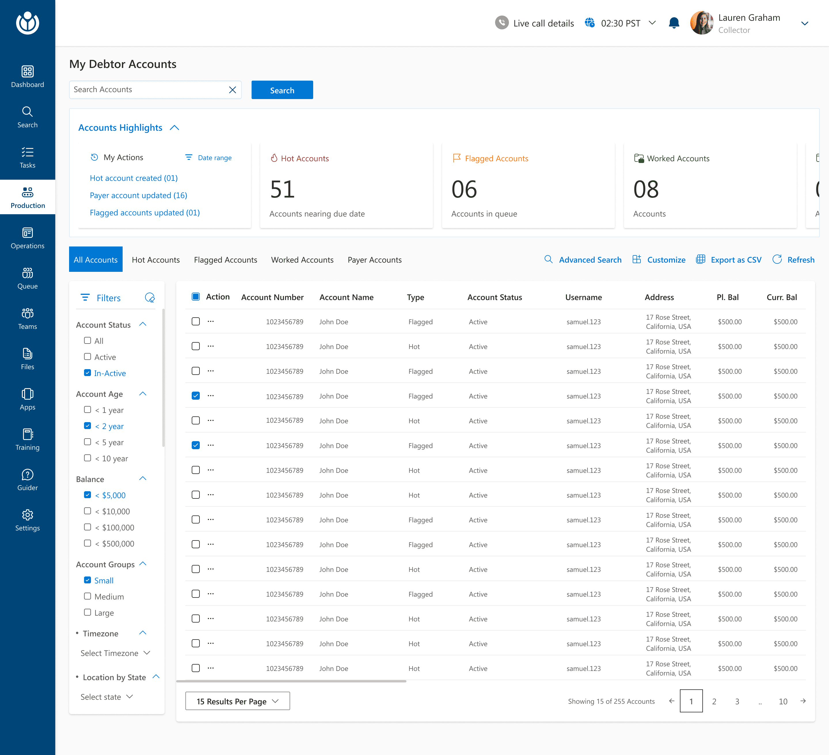
The header is now kept free of any navigational item other that notifications and profile details
The secondary navigation within the debtor list is a pivot menu to navigate to different types of accounts.
With this, all the different account types was brought under a single umbrella of ‘Debtor Accounts’ thereby creating a more organized structure and avoiding confusion.
The side navigation bar is now the primary navigation point for the agents. Each item further holds other functions.
Each of these items on the navigation bar have been categorized after several iterations with the CCMR3 team.

The users were directed to the Advanced Search page where they could create a new custom filter or use from a pre created custom filter
The save as filter would help users save a particular critera and revisit it on a later stage to further speed up the entire search experience.
The user can also use a pre created custom filter from the list below. The filter could be either personal to their own use or could be created as something public that could be used Org-wide.
The users will also have the option to edit and delete any filter.
The users could add more than one criteria and could customize the filter criteria even further.
The users could choose to run the search operation without saving it as a custom filter.
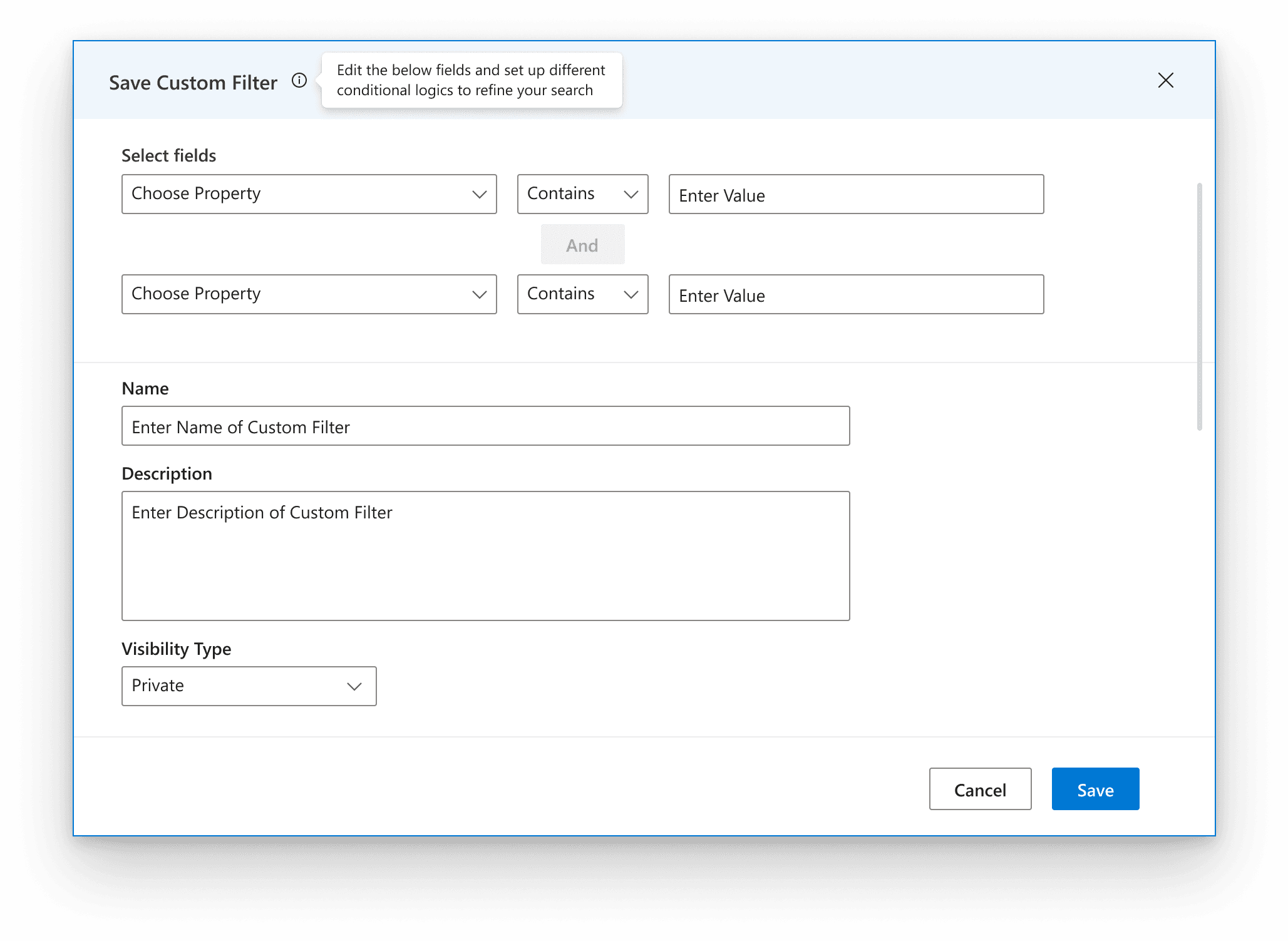
The users could choose a conditional logic to refine the search even further.
The filter could be named and added with a description to make it accessible on a later stage.
The users could select the visibility to be private or public

The users can run a search by altering the values mapped to the defined search criteria logic.
Redesiging the Debtor Dashboard
The Debtor Dashboard
The Debtor Dashboard was the space the Collection Agent would spend a larger part of his day, so we iterated along the way to come up with a solution to make the Debtor Dashboard an efficient space.
Debtor Accounts List
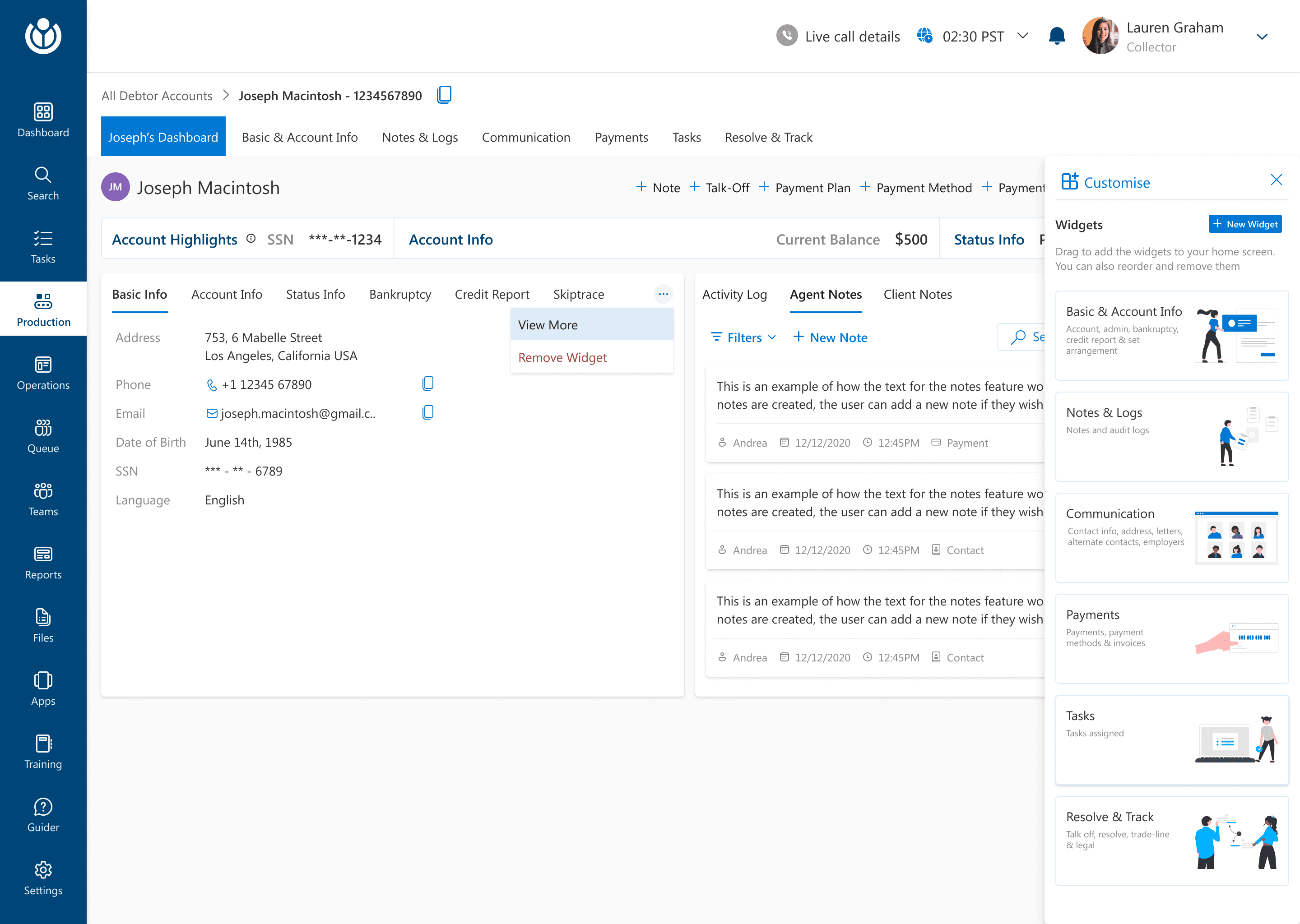
DEBTOR DASHBOARD- CUSTOMIZABLE DASHBOARD
DEBTOR DASHBOARD- WHAT'S NEW

Breadcrumbs to show the flow of navigation
The secondary flow of navigation within the Debtor Dashboard.
Following a pivot approach to give visual cues about the selected state.
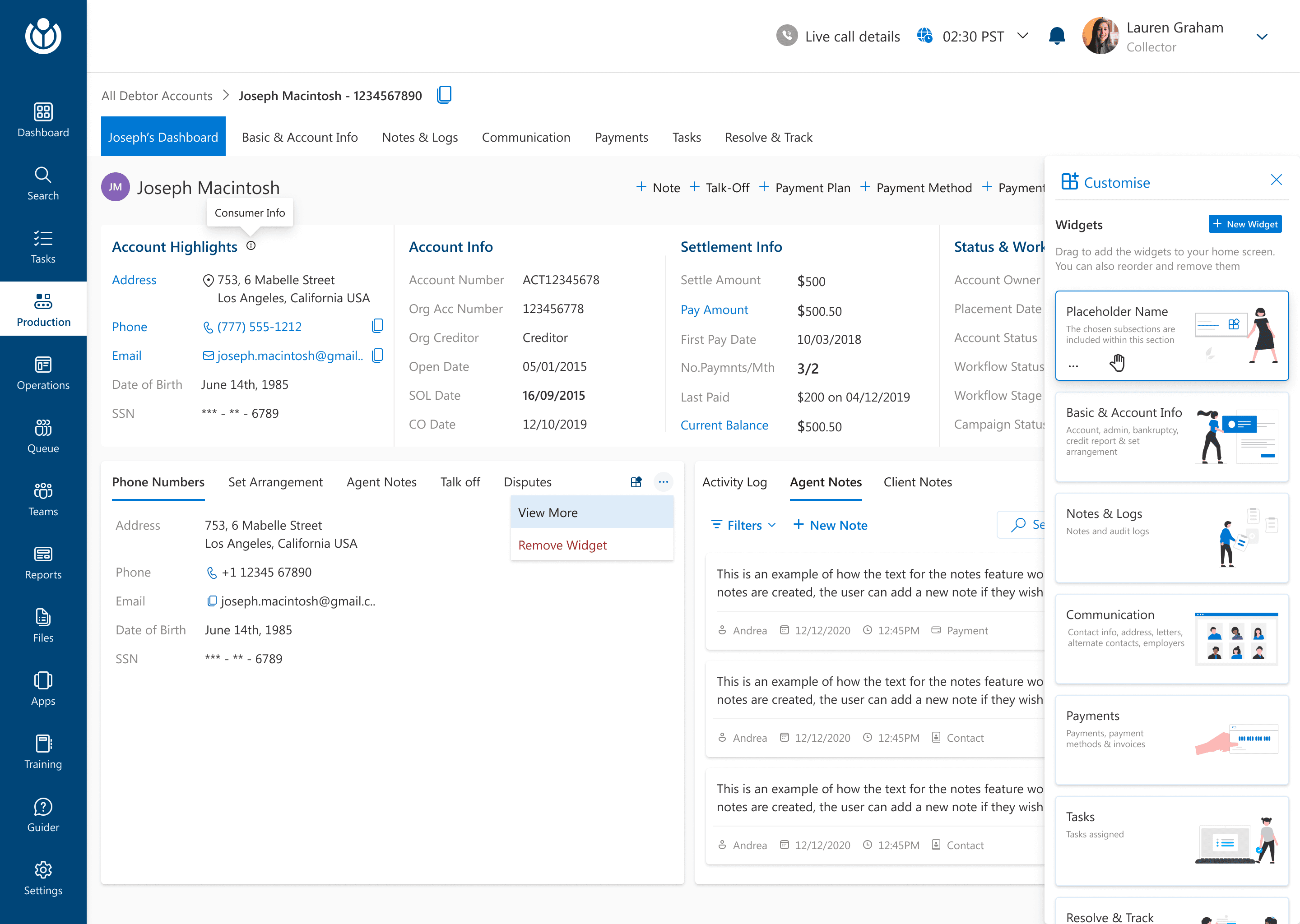
A collapsible Accounts Highlights section so that the user have the freedom to customize if they want to view the highlights in the expanded state at any given point or not.
Quick actions to have some common actions at the tip of users’ fingers and Newly introduced customize section.
Drag and Drop feature for customizable widget was introduced.
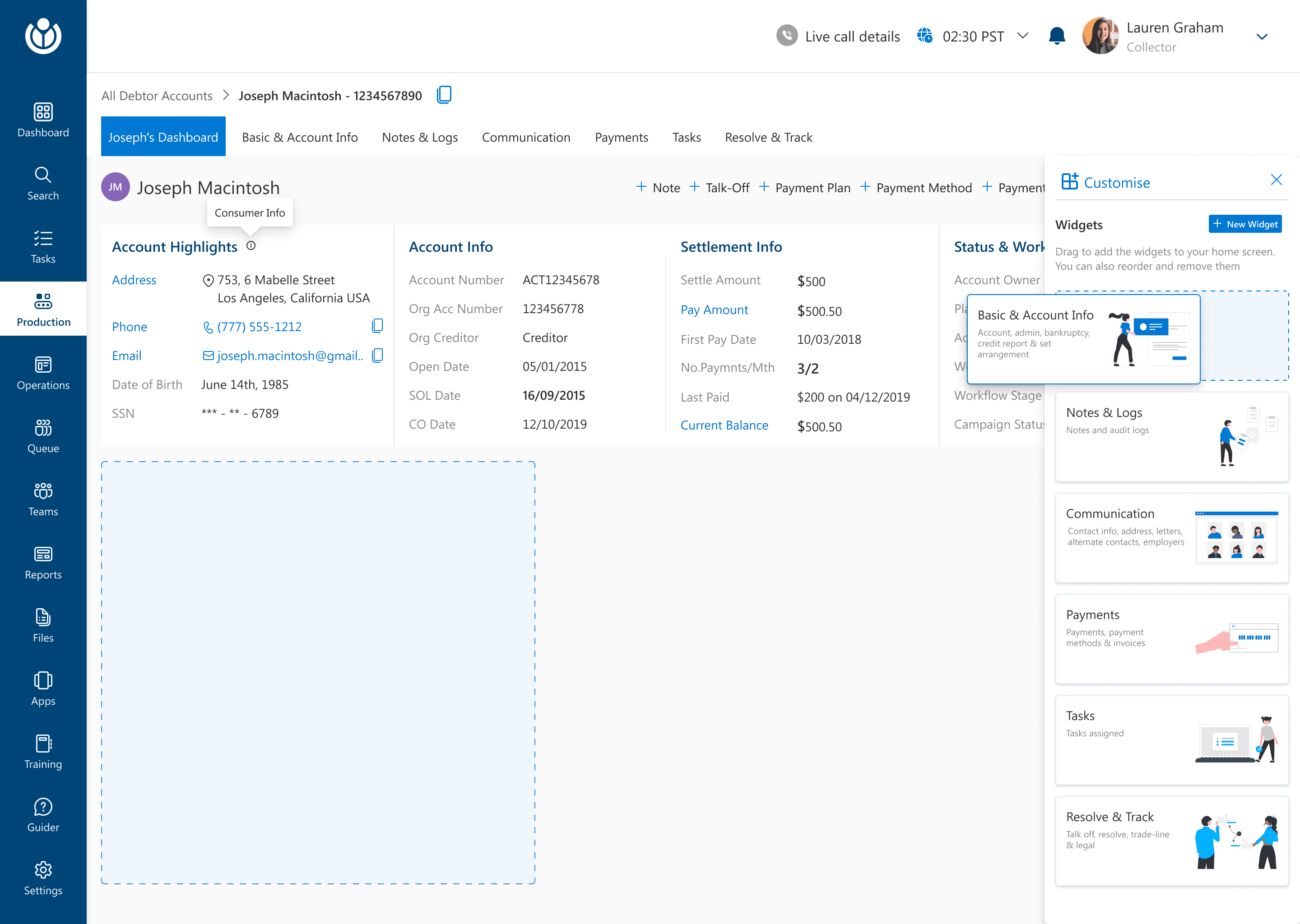
The agent can select any widget from the customize widget panel and also create a new widget.
The users can drag and drop a widget into the dashboard space to see any widget that they would like to see at any given point.
The collapsed state of Accounts Highlight
Some added Widgets
The sections within each widget are displayed as a pivot on the added widget.
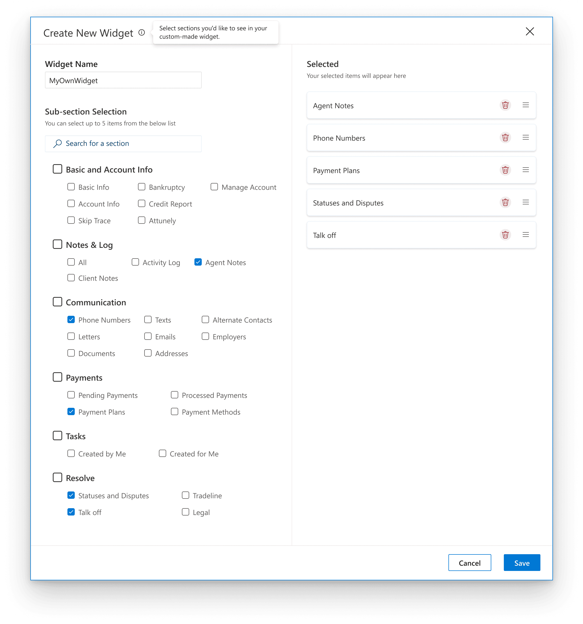
Create New Custom Widget Pop up
to create and save a new customized widget
The agents can select all the criteria, define their order to create a customized widget of their own to further increase the efficiency.
The customizable widget added with only the selected actions
The agents can drag and drop the newly created customized widget or edit it.
Some other tweaks from the Debtor Dashboard
These additional items needed urgent tweaks in phase 1. As for most other items within the debtor dashboard, the flow remained similar to what it had in the current application.
Before
After
After
Before
IMPROVING VISUAL CLUTTER-
REVAMPING THE PHONE NUMBER DISPOSITIONS TABLE
INTRODUCING ABILITY TO ADD PRESET TEXT MESSAGES
Dispositions Pop up
to set the phone number dispositions and statuses.
Add Text Message Pop up
to add new/pre set text messages

The link to set up dispositions and status through a popup
The users have a clearer and clutter free UI to set the dispositions and statuses.
Agents can set time zone to avoid reaching out to customers at odd timings
Agents can select from a list of pre set messages
Agents can also type in a text or edit preset texts.
Agents can view the chat history here


Did away with an overload of iconography within the table and provided a clickable section to set dispositions
Option to add new Text Messages was added


Some iterations that we made along the way
Exploring and eliminating multi column layout
Since the users had been using a multi column layout in certain dashboards, we explored using it in the current interface. But a round of A/B testing showed that users worked faster with a single table layout within a dashboard.
Explored a horizontal primary navigation bar
In our early explorations, we kept the primary navigation bar on the header so as to not deviate from the current tool, but slowly realized that the layers of navigation would confuse the users.
Inline editing and accordion within the table
To increase speeds, we explored inline editings within the table and an accordion approach to display all the details but early test results showed that this was dividing user focus and was an error prone experience so we shifted back to the modal approach for multi step actions.

Some early explorations
C H A L L E N G E S
Challenges and Reflections
Redesigning CollectLogic was one of the more challenging redesign projects that I worked upon. Some of the biggest challenges while redesigning were:
The acquainted users had been using the application for about a decade and they were getting their tasks done. We had to ensure a smooth transition for them to a new UI and new features without compromising on any task that they performed earlier.
We had to compromise on some suggested features due to a crunch of time and budget. Our major focus area was to simplify things so that the learning curve for the agents could be shortened as much as possible.
Finding the balance between designing for the old users, new users and business needs needed us to do a lot of going back and forth before we laid out the final designs.
My learnings:
While we tackled these challenges, my biggest learning was how to find the balance between user needs, business needs and a complex redesign. Redesigning any complex application meant defining clear boundaries to see what to retain from the older design, how to do it and how to balance it with new elements and a fresh perspective.
I M P A C T
Validations
We did multiple rounds of usability testing on the redesigned before rolling it out. This helped us gauge the effectiveness of the new design:
The time taken for an agent to find any debtor account in the new design took less than 3 minutes. In our early testings, it took around 10-12 minutes. This was a reduction by nearly 72%.
The overall rating of agent satisfaction also saw a stark improvement from 5/10 to 8/10 on the criteria covered which was nearly 60% improvement
After the release, error rates decreased significantly and the training costs were also cut down majorly. (The actual figues for these metrics have not been disclosed due to non disclosure)
N E X T S T E P S
Future Explorations
While we were focused on redesigning, there were some other new options that we couldn’t explore in this phase due to time and budget constraints. While we moved into the phase 2 of design, some key future enhancements we proposed we could explore in Phase 1 designs were :
Introduction of training elements or a glossary within sections- Exploring a CTA to further fill up gaps during training and give help to users at all times
Exploring Customizible workflows to enable users to create and save custom workflows, automating repetitive tasks and aligning the tool more closely with individual or organizational processes. This would further reduce task times, reduce errors and increase efficiency.
Explore options to introduce AI assisstance especially in recommending communication responses, or actions based on debtor or agent behavior.